Today i just sat and brainstormed some ideas for the first brief i am doing which is the Type Museum poster briefs. The main idea is to create bespoke posters, making them completely unique through processes and using type to create the content. I know there are certain processes I want to incorporate into this brief already such as; embossing and letterpress but I'm not sure where it will be appropriate and how i am going to go about it, but as i start to develop it will become more clear.

The content of the posters isn't overly important, as it is isn't something that is going to be focused on info ring someone, however the content may inform the processes.
I started investigating famous sayings revolving around type, as well as other sayings that overlap the creative 'world' as i want my posters to appeal to the creative audience. This will help the posters remain in context within the Type museum. I also realise with this brief i need to think about the packaging of the posters and make them a little more interesting then just being given a poster, but that will come once I have come up with some ideas.


From looking at the quotes, I have picked ones that i feel are more relevant, and i think have more scope to work with. I have picked some that have genuine meaning and some that are a little more fun. I broke them down into categories, in order to get the most appropriate, these are the selections i have made from the categories i made:
1. " Typography is two dimensional architecture, based on experience and imagination, and guided by rules and readability" - Herman Zapt
2. " Type appears at first to be a rigid medium: but like other rigid media, it is plastic to the living spirit of the craftsmen" - J.H. Mason
3. "Perfection is achieved, not when there is nothing left to add, but when there is nothing left to take away" - Antoine de Saint Exupery
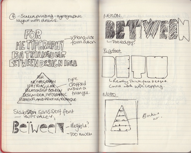
4. " For me Typography is a triangular relationship between design idea, typographic elements, and printing technique" - Wolfgang Weingart
5. "Designers are meant to be loved, not to be understood"
- Fabien Barral
6" My words fly up, my thoughts remain below: Words without thoughts never heaven go"
- William Shakespeare
7. "Less is only more where more is no good"
- Frank Lloyd Webber
8. Whatever talents i posses may suddenly diminish or suddenly increase. I can with ease become an ordinary fool. I may be one now. But it doesn't do to upset one's own vanity"
- Dylan thomas
9. Don't be too harsh to these poems until they're typed. I always think typescript lens some sort of certainty: at least, if the things are bad then, they appear to be bad with conviction"
- Dyaln thomas
10. " A letter does not blush"
- Marcus Tullius Cicero
After selecting the main phrases i want to use I have started doing some basic brainstorming and idea generation around them, just to try and get something out of my head and a direction i can focus on with the designs. These are by no means the final ideas, but they are a starting point to the development.
I have underlined the main themes that i want to incorporate with each poster, I am going to try and use a different theme for each poster, and then maybe create a range but i want to experiment first.

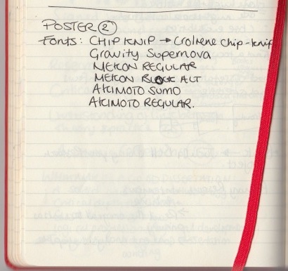
(Processes: Letter press - looking at layout and type selection)

(Process: Digital Print - looking at type manipulation, layout and
working with heavy weighted fonts)
(Process: Embossing the whole phrase, focus on appropriate
dont choices and possible type manipulation)

(Process: Digital Printing - Layout and appropriate font choice)


(Process: Embossing, formatting and layout)

(Process: Screen printing, Letterpress)

(Process: Digital Print - Architectural and geometric manipulation of type)

(Process - Screen printing, type manipulation, type working to create
an image)