Thursday, 20 October 2011

Poster 2


Seeing as my theme is to create the images using both black and red, with variations,
i decided to change the triangle into red. Again this has a higher visual impact, it also
creates an interesting pattern in the background. Because i felt after looking at the triangles that
the within the pattern it was really hard to distinguish the triangle shape, so i overlaid a large
triangle pattern, this just gives it definition and makes the pattern really stand out. 

Initial layout for the poster.

I've added the quote, so that it is even clearer what the
poster is about. I have used the same font across
the poster, adding continuity. 


Poster 2


Poster 2

I decided to go back and re-visit the triangle poster. I really wasn't happy with the initial ideas that i had been trying out. The concept still being using a triangle in some form.
So i decided to take on the shape of the triangle, but use type to create the triangle form, that way it still revolves around using type to create the image.
From that i decided that instead of just having the triangle form on its own, it'd look like a better formation overlapped, visually this creates more impact. 


General concept of chaos and triangles.

Using the triangles to create a structured chaotic pattern.

Triangle form using a lower case 't', using avant garde gothic,
with its thin stroke and heavy weight it creates definition whilst
creating the triangle pattern.

CRIT

I had a really useful crit today. We basically decided to structure the crit to best suit what we wanted, which worked out great because it gave us the opportunity to give appropriate feedback and receive it too. 

The general overview of the crit for me was that i have done a lot of work which in their terms is great, but Arthur's made a valid point that the main points aren't pointed out to you so although i have work it doesn't necessarily show what i have achieved and where I'm going. I think  theres two elements that are contributing to this, firstly as I'm working across briefs at the same time the posts are sporadic and don't necessarily relate. And secondly, i need to work in a more cohesive and controlled way, that way it should structure the outcomes better, and give a definition to my blog which its lacking. 

In my presentation i made it clear that the poster brief is currently the one I'm working on as i want to get it finished and done, so i managed tog et some good feedback on that. Aaron's i think being the most relevant as he made a valid point about the context of the posters because i advent thought about that yet, and i need to spend some time thinking about that. 

Generally i think I'm on the right track, and everyones feedback has really helped me see weaknesses that i wouldn't normally look at, and we decided to keep an eye on each others projects throughout the module so that we can help each other. 


_____________________________________________


Wednesday, 19 October 2011

Poster

This poster is driven by the content, as its all about architecture that has inspired me to look at the architecture of lettering, more specifically fontographer. I have seen some really lovely design work on behance where people have document the processes they have gone through to create logos etc and this is essentially what i want to do, expect the final product will be the anatomy of the type. 

For the basis of development i have used Helvetica, this is purely because it is such an easy font to use and gives me a plain sheet to work with. For the final poster i will be using a sans serif, and a serif font to create a small range of posters. So it kind of caters to everyones needs. 


__________________________________________

I have then messed around with adding architectural lines, and 
arrows just to give a bit more of a structure to the type and make it 
stand out a bit more, and look more obvious. I prefer the filled in arrows
as they stand out. I have also added to colour and played around with reversing
the type out to see the best visual.


____________________________________________

After looking into fonotgrapher i then went on to create my own guide
and mark out all the letters using illustrator. I decided to do the whole body 
copy to see how this would look. 
I think i was right in thinking it looks a little messy and should be simplified down.


________________________________________________
Playing around in fonotgrapher and looking at using architectural lines
and contructs. 

One thing i did realise is that I'm not sure i need all the text, it may work better just
using 'typography' as the whole thing may end up looking jumbled. 


__________________________________________
I started out by looking at the contructs you get within illustrator,
such as the anchor points. Layouts, fitting to grid etc, just to see
how that can be used an manipulated.
This bought me on to look into fontographer to see more of
a professional look at editing type. i have never used the software
before, but it was good to start playing around with it. 


Poster

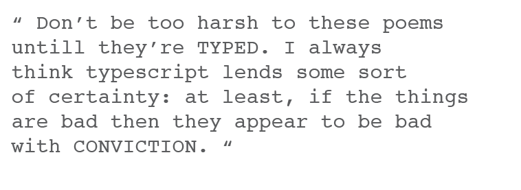
"Don't be too harsh to these poems, until they're typed. I always think typescript lends some sort of certainty: at least, if the things are bad then, they appear to be bad with conviction"
- Dylan Thomas


This is another phrase i am going to use for one of my posters. Personally i love it, its comical and incorporates the power of well typed typography which is great!
I really want to distill this saying down and use the process and the type to really re-iterate what is being said. 
Dylan Thomas was around a long time ago, so i want to create the poster using letterpress, and an old school font to try and symbolise the context with which Dylan was talking at the time. 

By playing around with the hierarchy and playing with colour and type this means that i can get a visual impact without having to bombard people with a huge visual. For me, simplicity is always better than throwing the kitchen sink at it... Which is ironic seeing as i tend to throw everything at a design and then distill it down!

I have played around with a lot of layouts which are all below, but i made a short .pdf just to outline the key factors within so it clearly shows where i am going.