I have put together all my new boards, with all the edits and the spelling errors checked, some grammar changed and some of the description edited. They all work together a lot better now and seem to really explain what is being shown. I am happy with these boards.
ISTD Boards
Crown 2
Poster Boards
Processing Boards Solicitor Boards
D&AD BOARDS

Showing posts with label Brief 1 - Posters. Show all posts
Showing posts with label Brief 1 - Posters. Show all posts
Saturday, 10 December 2011

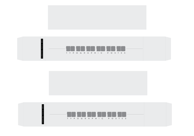
Re-designed bellyband
I have re-designed the bellyband so that i can print it off. I needed to do it in two parts so i have separated the bottom half from the top half. This is in order for it to wrap around and in one piece.

_______________________________________________
Thursday, 8 December 2011
Crit feedback
We had our Final crit today. I focused on getting my boards crited, the main focus on being around the boards and the spelling/layout. I wanted the boards to be all about the images, and then the information to come secondary.
Doing this was also very helpful because i printed them off a2 which meant that i could really see how the type and the images were working, seeing the balance between them both etc. Im really happy with the size of the font because this was very important, i need the type to be clear but not oversized. I think printing them off the images has really helped see what images are working and what aren't. I know i need to re-phtograph some images.
Generally the feedback was good, there were various spelling, grammar mistakes that needed fixing so I'm happy they were spotted, as well as switching over the images making some larger etc.
I have a list of corrections that i need to make but that can be fixed, i need to re-photograph and focus on getting some direction sorted for the crown brief because thats doing my head in.



Doing this was also very helpful because i printed them off a2 which meant that i could really see how the type and the images were working, seeing the balance between them both etc. Im really happy with the size of the font because this was very important, i need the type to be clear but not oversized. I think printing them off the images has really helped see what images are working and what aren't. I know i need to re-phtograph some images.
Generally the feedback was good, there were various spelling, grammar mistakes that needed fixing so I'm happy they were spotted, as well as switching over the images making some larger etc.
I have a list of corrections that i need to make but that can be fixed, i need to re-photograph and focus on getting some direction sorted for the crown brief because thats doing my head in.


Wednesday, 7 December 2011
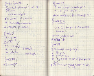
Boards
This brief and these boards are all about the processes and how the posters were designed and why. So it was vital that i show these on the boards. This brief and process have led to me using them in other briefs so it's very important that i make this clear with the briefs.
I have quite a few boards, as i needed to make it clear what was going on and why. Explaining each stage etc. So i have used 8 boards. This is the most i will have with my briefs by far, but i don't want to do any less because it won't look right and it won't explain everything that I have done, and i need to.


I have quite a few boards, as i needed to make it clear what was going on and why. Explaining each stage etc. So i have used 8 boards. This is the most i will have with my briefs by far, but i don't want to do any less because it won't look right and it won't explain everything that I have done, and i need to.
__________________________________________

(not sure what to put on the front, need to re-take pictures of posters in mount etc)


Tuesday, 6 December 2011
Photographs
From each of the photographs i have selected the ones that i think are more applicable, the ones that showcase the products better. The most frustrating thing was working with my camera, they looked alright on the screen then when i put them on the computer they were rubbish. So I'm going to have to re-photograph some of the photographs; ISTD and Type museum brief.
Here are some of the edited photographs:
Here are some of the edited photographs:
Monday, 5 December 2011
What's left
Doing the boards i have now worked out what i need to do with the last remaining briefs in order to get them finished so i can photograph them. I want to get the rest of the design work finished by today and tomorrow (DEC 5th/6th), so that i can start photographing the products tomorrow (DEC 6th/7th). This way the boards will be ready to be produced on Wednesday for Thrusday's crit.
WHAT I NEED TO DO:
ISTD:
- Cut Out postcards
- Cut out posters
- Finish Layouts
HOTEL:
- Need to do room visuals and pull together all photoshopped images
POSTER BRIEF:
- Need to put posters in their frames
- Need to print bellyband
SOLICITOR BRIEF:
- Finish business cards
- Do letterhead print
- Need to buy wax
PROCESSING:
- Re- Print map
D&AD:
- Need to cut out skins for Polaroid's
WHAT I NEED TO DO:
ISTD:
- Cut Out postcards
- Cut out posters
- Finish Layouts
HOTEL:
- Need to do room visuals and pull together all photoshopped images
POSTER BRIEF:
- Need to put posters in their frames
- Need to print bellyband
SOLICITOR BRIEF:
- Finish business cards
- Do letterhead print
- Need to buy wax
PROCESSING:
- Re- Print map
D&AD:
- Need to cut out skins for Polaroid's
Board photos and layouts
I have taken each board and do a very rough sketch of how i want the board to be delivered. One of the main things is i need to differentiate which board is which, as for some there are more than others. I have decided to put a band of colour along one side, that will link to the most prominent colour within the brief. this way when you go through them you can see they all link, regardless of the actual page numbers (even though these will be on as well).
Theres still a lot of photography needed to be done, but now i have worked out the exact angles that i want in order to photograph the deliverables in the best way. With some theres definite format that i want them to take whereas others i have done a variation just to see what's best, but i won't know until i have actually taken them.
The minimum amount of boards i am going to produce is 4 and the most is 10. I was a little worried about this because on the brief it says 4-6 boards, but i spoke to Lorenzo on Friday and one of my briefs is very process driven and i need to explain it with each deliverable, other wise it won't really make much sense. So i spoke to Amber this morning and she said that if its appropriate then I can have more than 6 boards. So that's good.. We'll see if that changes come the assessment briefing..
Boards Notes
I spent some time this weekend working out the information for my boards, the content for them and the general layout for them. By doing this i have now established more clearly where i am with each brief, what i need to finish in order to create them and what is the strongest elements of each brief. Unlike last year i want to produce some really professional boards, i think the key element is focusing on whats is the most appropriate elements to go on the boards.
I want to tell the story of the briefs, but i want them to focus mostly on the deliverables then the initial ideas etc, purely because that is all on my blog anyway. If they need to find where a concept came from thats where they go to find it anyway.
More than anything this has really helped me focus on what images of the deliverables that i want, i realise with one brief it is completely photoshopped as this is the most appropriate format for it, so thats just going to be down to me to sort out.
The next stage is to re-produce the layouts and work out roughly how i want each photo on the boards taken, what angles etc. Some of them i have a very distinct idea of what i want, but others its a case of trail and error.
This process has really helped me because its put all my briefs into perspective so now i know exactly what i need to do in order to finish the briefs.
Monday, 28 November 2011
Bellyband
In order to incorporate the broadening element of the TYPE MUSEUM into my project, i wanted it (from the outset) to be subtle. This was a lot more about the posters and their processes opposed to the branding element itself.
So, in order for this to work i have created the idea of using a bellyband that would be wrapped around the box in a commercial sense. I wanted it to be minimal because the posters are so different, and at the end of the day in a real world bellybands never last long.
From this, i have gone through the range of different fonts that i have tried, tested and some have worked some haven't. I tried out different layouts, because this is so large scale i wanted to use a slab serif font, purely because it would take up more space and could be represented more as an image than text.
Once i settled on the most appropriate layout, using the font i wanted i have added the generic type museum logo, this needs to stay the same as it will be the main representative of the brand being used.

There is one problem with this, printing it will be difficult as it's larger than the formats allowed downstairs, so I'm either going to leave it as a mock up, or just print one side. Im undecided yet.
Sunday, 27 November 2011
THIS WEEK
So, this week was all about the production side of my briefs. It has actually been a really successful week, i have got loads done and all the deliverables for the D&AD and Processing brief are pretty much done, as well as a significant improvement with the solicitor brief.
WHAT I'VE DONE:
D&AD
Ticket - DONE
Tote - DONE
Publication - DONE
Poster - DONE
Certificate - DONE
Processing
Map - DONE
Tote - DONE
T-shirt - DONE
Tag - DONE
Signage - DONE
Animation - DONE
Poster - DONE
Flyer - DONE
Solicitor
Designs (brand identity) - DONE
Envelope - DONE
Letterhead Holder - DONE
Poster
Packaging - DONE
Rasters - DONE
Less is only - DONE
Mount - DONE
WHAT I NEED TO DO:
D&AD
Polaroid Skin
Display Banners
Processing
Put all together and shoot
Solicitor
Business Card - NEED STOCK AND LASER CUT EMBOSS
Large Envelope - NEED TO DESIGN
Compliment Slip - NEED STOCK TO PRINT
Letterhead - NEED STOCK TO PRINT
Seal - NEED TO ORDER
(ALL STOCK IS ORDERED WAITING TO BE DELIVERED)
Poster
Need to mount all the posters
Need to photograph them all
Need to do slip to go around box
Need to do small publication of each poster to go into the box
Need to print the three reaming posters onto handmade stock
So generally this is good, the Processing brief is now finished just need to photograph them all together. The D&AD brief is nearly done just need to do the polaroid skin and display banner. With the solicitor brief i need the stocks to come through in order for me to send the rest to print.
Theres still quite a bit to do with the poster brief, but should be no more than 2 days work.
Then i can focus on finishing the ISTD brief and the Crown brief.
WHAT I'VE DONE:
D&AD
Ticket - DONE
Tote - DONE
Publication - DONE
Poster - DONE
Certificate - DONE
Processing
Map - DONE
Tote - DONE
T-shirt - DONE
Tag - DONE
Signage - DONE
Animation - DONE
Poster - DONE
Flyer - DONE
Solicitor
Designs (brand identity) - DONE
Envelope - DONE
Letterhead Holder - DONE
Poster
Packaging - DONE
Rasters - DONE
Less is only - DONE
Mount - DONE
WHAT I NEED TO DO:
D&AD
Polaroid Skin
Display Banners
Processing
Put all together and shoot
Solicitor
Business Card - NEED STOCK AND LASER CUT EMBOSS
Large Envelope - NEED TO DESIGN
Compliment Slip - NEED STOCK TO PRINT
Letterhead - NEED STOCK TO PRINT
Seal - NEED TO ORDER
(ALL STOCK IS ORDERED WAITING TO BE DELIVERED)
Poster
Need to mount all the posters
Need to photograph them all
Need to do slip to go around box
Need to do small publication of each poster to go into the box
Need to print the three reaming posters onto handmade stock
So generally this is good, the Processing brief is now finished just need to photograph them all together. The D&AD brief is nearly done just need to do the polaroid skin and display banner. With the solicitor brief i need the stocks to come through in order for me to send the rest to print.
Theres still quite a bit to do with the poster brief, but should be no more than 2 days work.
Then i can focus on finishing the ISTD brief and the Crown brief.
Less is only more print
Whilst down in the print room i noticed the sport colour print that has been done, and immediately i thought that this was a great idea for this poster. It is very appropriate to the content that I have chosen. Im so happy to have come ups with this idea, because it really delvers on a visual note and resonates the content.
Speaking to James, i had to set the files colour to 243 across the RGB scale, this was quite tricky because until i printed it i would have no idea how well it would work. I decided to do it across two colours, using the red and the white because i have used a lot of white background in the posters so far and the colour choices were red black and white. So i have printed off both.
// INITIAL DEVELOPMENT AND VISUAL HIYERACRY
// FINAL POSTERS
Whats really interesting with these posters, was when they were printed on the red you initially couldn't tell at all and both James and I thought it hadn't work. However, once the light caught it it worked better than the white one. What i really like is the different colours it creates with the different light, and ow it has v=become a really visually interactive poster because you have to view it from different angles in order for it to work.
I am going to mount both and see which one i preferrer, but i think the red one is defiantly the strongest.
Printing processes
In order tog et the right print technique i have done some little samples on the best way to get the print.
OPTION 1 Firstly, i tried embossing the larger prating into stock, this has actually worked out really well, so here i could just print the design onto the appropriate substrate and then emboss the poster with the printing plate. OPTION 2 Secondly, I PVAed the wood and then ran some ink across it to print onto the sheet, after putting loads of PVA on i realised that i had lost all the definition of the print, so it would come out as a huge blob. Which it did. So i then decided to really water the PVA down, and then printing it. This worked out a lot better because the liquid just soaked into the wood, leaving the detail highlighted.
Now, Both options work. Personally i think the best idea for time and print wise will be tog et the designs printed onto the hand made stock and then emboss the designs myself. The MDF will be too thick to fit through the huge roller in the textiles room. I think this will work better and i can get more definition using this technique.
OPTION 1 Firstly, i tried embossing the larger prating into stock, this has actually worked out really well, so here i could just print the design onto the appropriate substrate and then emboss the poster with the printing plate. OPTION 2 Secondly, I PVAed the wood and then ran some ink across it to print onto the sheet, after putting loads of PVA on i realised that i had lost all the definition of the print, so it would come out as a huge blob. Which it did. So i then decided to really water the PVA down, and then printing it. This worked out a lot better because the liquid just soaked into the wood, leaving the detail highlighted.
Now, Both options work. Personally i think the best idea for time and print wise will be tog et the designs printed onto the hand made stock and then emboss the designs myself. The MDF will be too thick to fit through the huge roller in the textiles room. I think this will work better and i can get more definition using this technique.
Larger poster raster
After sitting in the laser cut room for 2 and a half hours......... luckily i book fit at the end of the day and brought my laptop with me.. I managed to get the large restarted printing plate done. IM so glad i made the mistake of not reversing the print earlier on in my development because i think if i had to do it with this one i would have shot someone!
I am really happy with the outcome though, this is a really strong plate and i think its simplicity will deliver some really good effects once i start printing with it. I'm really happy, the next stage will be to get the right printing processes for the 3 last posters so that i can get them done.
I am really happy with the outcome though, this is a really strong plate and i think its simplicity will deliver some really good effects once i start printing with it. I'm really happy, the next stage will be to get the right printing processes for the 3 last posters so that i can get them done.
Wednesday, 23 November 2011
Raster poster mark 2
After the initial rastering i did of the dyland sayings, i decided to enlarge them because they were too small to function as a printing plate. I have made them much bigger so you can really pick out the detail. What i also realised was that i needed to reverse the imagery so that it was mirror image in order for it to print successfully onto the paper that i will use. this was something that i hadn't thought-out about a and without the development i would have still had no idea. SO it was a complete waste of time. I am much happier with the outcomes here because they are much larger and they will transfer across a lot easier.
// REVERSED OUT IMAGES


Tuesday, 22 November 2011
Box production
This is the final stages of the production of my poster box. It is all finished now, and i actually managed to help which was good! It works so well, and all the posters fit within it, the next stage is to varnish it and then finish the posters to put in. I want to create a bell band to wrap around and a publication to go along side which will tell the person what each poster is, how it was made and why.
Box
Box
Poster rasters
I have finally been able to do my two other posters, the raster of the Dylan thomas sayings. It took quite a bit of 'arsing about' before i could actually get the image to raster because for some reason the laser cutter wouldn't read the file but it worked on other computers, and this was annoying as it ate into my laser cutter slot.
However, i did manage to raster them. Immediately i realised that they are too small, I haven't yet printed with them so I'm not sure how much detail i will actually get but i have a feeling it will come out as a huge blob. So this means I will have to re-print them tomorrow. This isn't a problem as i have a slot booked, so I'm just going to have to enlarge the files. Hopefully after that they will work.
dylan
However, i did manage to raster them. Immediately i realised that they are too small, I haven't yet printed with them so I'm not sure how much detail i will actually get but i have a feeling it will come out as a huge blob. So this means I will have to re-print them tomorrow. This isn't a problem as i have a slot booked, so I'm just going to have to enlarge the files. Hopefully after that they will work.
dylan
Poster Packaging
Poster Packaging
I managed to start manufacturing my box for my posters. This was really exciting, because i haven't done anything like this before, and being able to see something come from nothing is brilliant. I wasn't allowed to use all the big machinery because unfortunately I'm too small.. Which isn't great but i did get to help out here and there!
We managed to get the frame of the box together and glued, and tonight I have to go pick up some hinges for the lid. Tomorrow will be a case of putting the lid and finishing it, as in sanding and varnishing, if i choose to varnish. I think i will because at the moment it looks untreated and a little cheap.
I managed to start manufacturing my box for my posters. This was really exciting, because i haven't done anything like this before, and being able to see something come from nothing is brilliant. I wasn't allowed to use all the big machinery because unfortunately I'm too small.. Which isn't great but i did get to help out here and there!
We managed to get the frame of the box together and glued, and tonight I have to go pick up some hinges for the lid. Tomorrow will be a case of putting the lid and finishing it, as in sanding and varnishing, if i choose to varnish. I think i will because at the moment it looks untreated and a little cheap.
Monday, 21 November 2011
Poster packaging
I have done some research into ideas for the packaging of my posters, I knew that i wanted it to be box shaped, and that it needed to fit all the different a2 posters that I have created.
It's really important to me that it is of high quality, and has the handmade finish that the other posters I have done have. I need to do this to also tie in the posters and packaging, so that they all work together as a set.
So, i came up with the idea of creating a hand crafter box that would hold the posters. Now, i wasn't sure about the best way to go about this, because i needed to fact run how long it would take to make a box.
I went down to Woodwork, and had a really good chat with Matt Parks, he told me that it would take put o an hour and a half to create the box. Once done, adding joining etc and varnishing, if i choose too, would add another hour and half so essentially half a day.
This is brilliant because i thought it would take FOREVER!
So this is the avenue i am going to go down in order to create my packaging. I have done the appropriate measurements so that the box will fit all the posters.


It's really important to me that it is of high quality, and has the handmade finish that the other posters I have done have. I need to do this to also tie in the posters and packaging, so that they all work together as a set.
So, i came up with the idea of creating a hand crafter box that would hold the posters. Now, i wasn't sure about the best way to go about this, because i needed to fact run how long it would take to make a box.
I went down to Woodwork, and had a really good chat with Matt Parks, he told me that it would take put o an hour and a half to create the box. Once done, adding joining etc and varnishing, if i choose too, would add another hour and half so essentially half a day.
This is brilliant because i thought it would take FOREVER!
So this is the avenue i am going to go down in order to create my packaging. I have done the appropriate measurements so that the box will fit all the posters.


// Visual Mockup

Friday, 18 November 2011
DELIVERABLES
DELIVERBALES FOR EACH BRIEF: (RE-evaluated)
BRIEF 1 – 4 posters, all need to be mounted
and packed in box design
BRIEF 2 – (NEW SOLICITOR) Stationary set;
envelope, letterhead, business card, compliment slip, pack and seal.
BRIEF 3 – ; Stationary, welcome pack, keys
(+packaging), menu, receipt holder, fire + safety signs.
BRIEF 4 – Publication
BRIEF 5 – Tote bag, event map, signage, animation,
t-shirt, tag, poster and flyer.
BRIEF 6 – Tote bag, publication,
certificate, powerpoint, ticket, poster and polaroid.
Subscribe to:
Posts (Atom)