Showing posts with label Brief 5 - Solicitor. Show all posts

Monday, 12 December 2011

Solicitor Brief Evaluation

 This was the first brief I’ve done for a live client, this was working with a new Solicitor company in London called Crabtree. The client was really easy to work with, and I thoroughly enjoyed working with them because they essentially let me do what I wanted whilst having their own ideas for what they wanted. What also sweetened this brief was I was getting paid £250 to do a logo for them. I created 2 different proposals for them and sent them through, they picked one and after tweaking it here and there they settled on the logo they wanted.
What was also interesting about the brief was it was the first corporate design work I have done, and I enjoyed it. After a discussion in one of my tutorials I decided that I would turn this into a larger brief because there were ideas I wanted to do with the stationary that I hadn’t had the chance to do with the actual brief as they only wanted a logo. What made it easier to turn into a large brief was I already had the building blocks, I just needed to start with the logo from scratch and turn it into something. I still wanted it to have that corporate feel to it, however I wanted it to be something that I could put into my portfolio. The main aim for the brief was to create a range of stationary, focusing on the stock choices, editing the logo and using processes to enhance the stationary. Using skills I had learnt in the other briefs I transferred them over to this brief, so I could form a coherent brand.
As I said before this was all about creating something that was corporate still, and so I gave myself the restrictions of working with generic sizes for envelopes etc, this was more for my own skills so that I could work with something in this style and produce it well.
One idea that I had with this brief that I had had with others was using a seal, I think that this fitted within the brief perfectly because it would link to the style of the work, as well as adding a contemporary yet traditional value to the project. I also wanted to use the right stock for this, and I using the samples I received from GFSmith I could make an informed decision about the best paper stock to use.
Again this brief had to have a quick turn around, but due to the other briefs I knew how to do this, and as I had a clear set of deliverables for it I knew the direction I needed to head in.


Solicitor Boards

Saturday, 10 December 2011

New edited boards

I have put together all my new boards, with all the edits and the spelling errors checked, some grammar changed and some of the description edited. They all work together a lot better now and seem to really explain what is being shown. I am happy with these boards.

ISTD Boards Crown 2 Poster Boards Processing Boards Solicitor Boards
D&AD BOARDS


Seal and emboss

I have finally got my seal, so i had some fun doing some practice trials with it in order to see what it would look like, just for when i photograph it.


I have also practised doing some embossing because this is important to get the business card right. I have selected the stock and actually embossed on the stock, so this was useful. I had to do several different trails but i managed to get it to work

links to stock

I have ordered stock from GFSmith in order to get some ideas for the applicable stocks for each of my briefs. This is vital with ISTD and for the Solicitor brief, as with the poster brief the stock is secondary. So from the mass amount of samples i got i then selected the ones that are most appropriate.
Some varying in gsm in order to have some that would be embossed, or just printed on etc.


Thursday, 8 December 2011

Crit feedback

We had our Final crit today. I focused on getting my boards crited, the main focus on being around the boards and the spelling/layout. I wanted the boards to be all about the images, and then the information to come secondary.
Doing this was also very helpful because i printed them off a2 which meant that i could really see how the type and the images were working, seeing the balance between them both etc. Im really happy with the size of the font because this was very important, i need the type to be clear but not oversized. I think printing them off the images has really helped see what images are working and what aren't. I know i need to re-phtograph some images.

Generally the feedback was good, there were various spelling, grammar mistakes that needed fixing so I'm happy they were spotted, as well as switching over the images making some larger etc.

I have a list of corrections that i need to make but that can be fixed, i need to re-photograph and focus on getting some direction sorted for the crown  brief because thats doing my head in.


Wednesday, 7 December 2011

Boards

// MAIN BOARD LAYOUT

This is the master sheet for my boards, putting my main information on it. I have added a strip of colour in order to help differentiate the boards.
_______________________________________


Tuesday, 6 December 2011

Photographs

From each of the photographs i have selected the ones that i think are more applicable, the ones that showcase the products better. The most frustrating thing was working with my camera, they looked alright on the screen then when i put them on the computer they were rubbish. So I'm going to have to re-photograph some of the photographs; ISTD and Type museum brief.

Here are some of the edited photographs:

Photographs

I spent today getting all my products together, printing off the last part of my ISTD, printing off the bellyband for my poster brief and printing off the processing map. After getting all those files completed and ready to print i have spent the whole day photographing the projects.
This actually took a a lot longer than i thought it was going to take. Which was good and bad, good because i had a range of products and bad because it was time consuming and i didn't think it'd take as long as it did.


photo4
Photo 3
pohoto2


Pro 2
proc
Dan 2
Dan 1
Untitled
Sol 2
Sol 2

Monday, 5 December 2011

Solicitor


// Initial mock up, made me realise that i'd done the image logo too big and some of the text wash';t centred. I need to get this right because i plan to do my double sided print tonight so it's important that the layout works now.
___________________________________________________________________________________

// I have re-designed the layout and made the logo smaller so hopefully when i re-print it will work right.


Solicitor


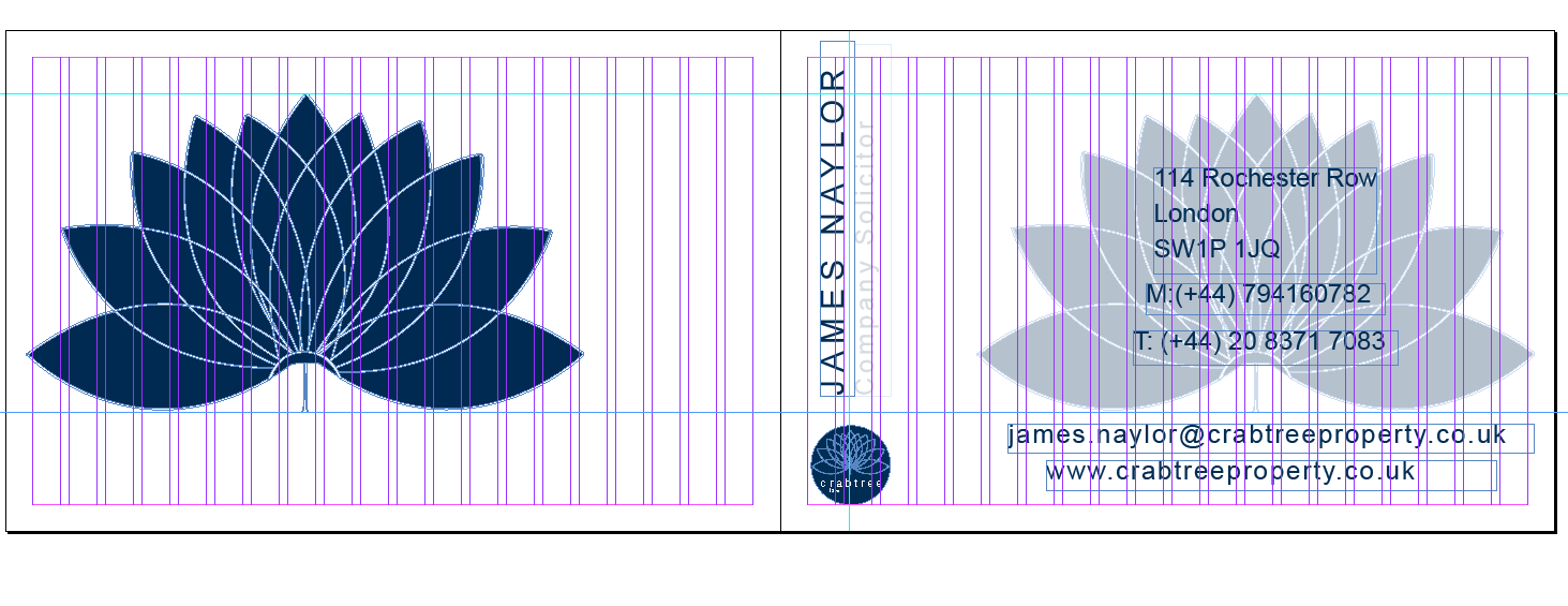
// This is some initial working out for the business cards, i've already worked out that i want to emboss the front and laser cut out the pattern. its now a case of designing the business card but most importantly designing the text around where the emboss is going to be. 


What's left

Doing the boards i have now worked out what i need to do with the last remaining briefs in order to get them finished so i can photograph them. I want to get the rest of the design work finished by today and tomorrow (DEC 5th/6th), so that i can start photographing the products tomorrow (DEC 6th/7th). This way the boards will be ready to be produced on Wednesday for Thrusday's crit.


WHAT I NEED TO DO:

ISTD: 
- Cut Out postcards
- Cut out posters
- Finish Layouts

HOTEL:
- Need to do room visuals and pull together all photoshopped images

POSTER BRIEF:
- Need to put posters in their frames
- Need to print bellyband

SOLICITOR BRIEF:
- Finish business cards
- Do letterhead print
- Need to buy wax

PROCESSING:
- Re- Print map

D&AD:
- Need to cut out skins for Polaroid's


Board photos and layouts

I have taken each board and do a very rough sketch of how i want the board to be delivered. One of the main things is i need to differentiate which board is which, as for some there are more than others. I have decided to put a band of colour along one side, that will link to the most prominent colour within the brief. this way when you go through them you can see they all link, regardless of the actual page numbers (even though these will be on as well).


Theres still a lot of photography needed to be done, but now i have worked out the exact angles that i want in order to photograph the deliverables in the best way. With some theres definite format that i want them to take whereas others i have done a variation just to see what's best, but i won't know until i have actually taken them.


The minimum amount of boards i am going to produce is 4 and the most is 10. I was a little worried about this because on the brief it says 4-6 boards, but i spoke to Lorenzo on Friday and one of my briefs is very process driven and i need to explain it with each deliverable, other wise it won't really make much sense. So i spoke to Amber this morning and she said that if its appropriate then I can have more than 6 boards. So that's good.. We'll see if that changes come the assessment briefing.. 

Boards Notes


I spent some time this weekend working out the information for my boards, the content for them and the general layout for them. By doing this i have now established more clearly where i am with each brief, what i need to finish in order to create them and what is the strongest elements of each brief. Unlike last year i want to produce some really professional boards, i think the key element is focusing on whats is the most appropriate elements to go on the boards. 
I want to tell the story of the briefs, but i want them to focus mostly on the deliverables then the initial ideas etc, purely because that is all on my blog anyway. If they need to find where a concept came from thats where they go to find it anyway. 

More than anything this has really helped me focus on what images of the deliverables that i want, i realise with one brief it is completely photoshopped as this is the most appropriate format for it, so thats just going to be down to me to sort out. 

The next stage is to re-produce the layouts and work out roughly how i want each photo on the boards taken, what angles etc. Some of them i have a very distinct idea of what i want, but others its a case of trail and error. 

This process has really helped me because its put all my briefs into perspective so now i know exactly what i need to do in order to finish the briefs. 


Monday, 28 November 2011

Large Envelope


________
// FINAL DESIGNS

// INSIDE

// OUTSIDE

Sunday, 27 November 2011

THIS WEEK

So, this week was all about the production side of my briefs. It has actually been a really successful week, i have got loads done and all the deliverables for the D&AD and Processing brief are pretty much done, as well as a significant improvement with the solicitor brief.

WHAT I'VE DONE:

D&AD
Ticket - DONE
Tote - DONE
Publication - DONE
Poster - DONE
Certificate - DONE

Processing
Map - DONE
Tote - DONE
T-shirt - DONE
Tag - DONE
Signage - DONE
Animation - DONE
Poster - DONE
Flyer - DONE

Solicitor
Designs (brand identity) - DONE
Envelope - DONE
Letterhead Holder - DONE

Poster
Packaging - DONE
Rasters - DONE
Less is only - DONE
Mount - DONE

WHAT I NEED TO DO:

D&AD
Polaroid Skin
Display Banners

Processing
Put all together and shoot


Solicitor
Business Card  - NEED STOCK AND LASER CUT EMBOSS
Large Envelope - NEED TO DESIGN
Compliment Slip - NEED STOCK TO PRINT
Letterhead - NEED STOCK TO PRINT
Seal - NEED TO ORDER

(ALL STOCK IS ORDERED WAITING TO BE DELIVERED)

Poster
Need to mount all the posters
Need to photograph them all
Need to do slip to go around box
Need to do small publication of each poster to go into the box
Need to print the three reaming posters onto handmade stock


So generally this is good, the Processing brief is now finished just need to photograph them all together. The D&AD brief is nearly done just need to do the polaroid skin and display banner. With the solicitor brief i need the stocks to come through in order for me to send the rest to print.
Theres still quite a bit to do with the poster brief, but should be no more than 2 days work.
Then i can focus on finishing the ISTD brief and the Crown brief.


I have taken some photos of the all the products I have produced this week, some have turned out better than others, but this was more of an experimentation then a final shoot. however some of them do work well so i will use them as the final shots. It was a good time for me to gage how much I've done this week, and what needs to be finished. I am very close to getting three briefs finished now, so thats great and i can focus on the others and get them done.

[SCRIBD]

Thursday, 24 November 2011

Compliment slip development


For the complement slip, again it was a case of bringing the elements that i have already used together to start forming a coherent feel tot he brand. As I'm really starting to get a feel for how i want it all to look, this was more playing around with the more appropriate layout than the chosen images i will use.

I defiantly wanted this to link with the envelope design as this is genially what i would be sent in, so it makes sense that that style resonates with the design. This is why i have chosen the design with the logo and the line. It beings together the two designs but i can still play around with the layout of the pattern designs.


___________________________________________________


__


// FINAL DESIGN

Letterhead development


I have tried a variety of different variations with regards to the look of the letterhead that i will be creating. Some just suing the logo, some using the pattern more than the logo. I want it still to have the feel of a gernic letterhead, so I'm not playing around with the layout of the body copy too much, its more about the design that will go around it than the look of the layout of text.

I started to pull together the other elements i have been using with the envelope design, and the letterhead holder design, again to form a more coherent look to the stationary. I particularly like the last lot of designs, they are booming more professional in their look and feel and are starting to take on an element of corporate design which is what i wanted.

__________________________________________________

This is the final design i have settled on, the patterns in the middle will be knocked back again, so you can see them but only just, this is so that they won't interfere with he body copy that will go over the top. I want it to be subtle. 

Designs so far


These are the stationary designs that i have put together so far, pulling them together like this gives me the opportunity to stand back and see how the brand is working as a whole. This is important because i need to check that the imagery it really working. I think its really starting to come together, and once printed they will work very well together. It's is very corporate, a bit more corporate than i would have liked, however the industry that this is marketed within needs thats professional look so inadvertently i think i have designed for that audience quite well. 


Letterhead Cover design and Colour


After settling on the deliverables, and the style i wanted to create I have chosen to develop the 'blue range'. this is for the mock ups and the hand in, but in total there would be 3 ranges for the colour choice. Taking on the blue range i used the pantone swatch books to create my colour swatches for the stationary. As there will be range of different media used, i have taken a selection from the coated, uncoated and sold matt range. this way all my basis are covered when it comes to printing off my stationary. 


// COLOUR SWATCHES


LETTERHEAD HOLDER

After choosing the appropriate colours, i have developed some ideas for the design of the letterhead holder. Seeing as this is going to be one of the larger prints and have more detail on it. By doing this first i can take elements of it and bring it across into other development for the other formats. 

[ IMAGES OF SKETCHES FROM NOTEBOOK]

I chose to go with a more fluid looking design, with some curves in it so that it looks more professional, and has more of a corporate feel to it. Once that design was done, i have brought in the pattern design i created when making the seal development. This is to add another visual to the piece apart from just the logo. 


// THE FINAL DESIGN

ENVELOPE DESIGN

Within this i decided to take on the envelope design, and bring across elements from the letterhead holder so that it starts to form a coherent brand image. The envelope shape is the standard envelope design. This is because i wanted it to have more of a corporate feel. The envelope design is fairly simple in its design, and hold all the elements that i needed it to. The logo being the key feature. it must be the most recognisable element of the design. 
I wanted the inside to be covered, again to add a different visual, so that its not just a flat an standard envelope. 

// INSIDE

// FRONT


I have really knocked back the opacity on the pattern design, this is so you can just about see it
but it won't detract from the main logo

// FINAL DESIGN