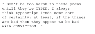
"Don't be too harsh to these poems, until they're typed. I always think typescript lends some sort of certainty: at least, if the things are bad then, they appear to be bad with conviction"
- Dylan Thomas
This is another phrase i am going to use for one of my posters. Personally i love it, its comical and incorporates the power of well typed typography which is great!
I really want to distill this saying down and use the process and the type to really re-iterate what is being said.
Dylan Thomas was around a long time ago, so i want to create the poster using letterpress, and an old school font to try and symbolise the context with which Dylan was talking at the time.
By playing around with the hierarchy and playing with colour and type this means that i can get a visual impact without having to bombard people with a huge visual. For me, simplicity is always better than throwing the kitchen sink at it... Which is ironic seeing as i tend to throw everything at a design and then distill it down!
I have played around with a lot of layouts which are all below, but i made a short .pdf just to outline the key factors within so it clearly shows where i am going.


No comments:
Post a Comment